This post may contain affiliate links. If you choose to buy through these links, I may receive a small commission at no additional cost to you.
The other day, I checked into this tiny boutique hotel out of town. The second I stepped past the door, I literally just froze.
It hit me instantly. This insane wave of warmth and luxury. The place looked incredibly expensive, but my brain spent the first ten minutes just trying to figure out what the actual trick was.
Then it clicked. The walls were a deep, earthy terracotta. But it didn’t stop there. The baseboards? Same terracotta. The door? Terracotta. Even the window frames and the entire ceiling were covered in that exact same, deep shade.
No white borders. No chopped-up trim lines. Nothing. That is exactly what designers mean by colour drenching.
Let’s be honest. For decades, we have all blindly followed this one boring home decor rule: paint your walls a nice color, but keep your ceilings stark white and your trims off-white. It’s what everyone does. It’s safe.
But in reality? That safety net is exactly what makes our rooms look smaller, boxed-in, and honestly, a bit dated.
When you throw out that old rulebook and drench a space in one single shade from floor to ceiling, something wild happens. The room’s physical boundaries just vanish. Your eyes stop bumping into those aggressive white contrast lines at the top.
The corners melt away. Suddenly, a tiny spare bedroom feels like a high-end luxury suite.
It is easily the biggest interior design shift happening right now across modern apartments. But here is the catch : it can go south incredibly fast.
If you want to nail this trend, you need to understand the most common colour drenching mistakes before picking up a brush. Pick the wrong paint finish or miscalculate how daylight hits your space, and your cozy sanctuary can quickly feel like a dark, suffocating cave.
If you are currently staring at a blank wall with a paint roller, hold on. Let’s break down the actual painting blunders you need to dodge to get that flawless look without wasting your money.
The Actual Concept (Behind the Hype)
To completely strip away the fancy design talk, colour drenching is just taking one single paint color family and wrapping every surface in the room with it.
Everything. The drywall, the crown molding, the doors, the window trims, and the ceiling.
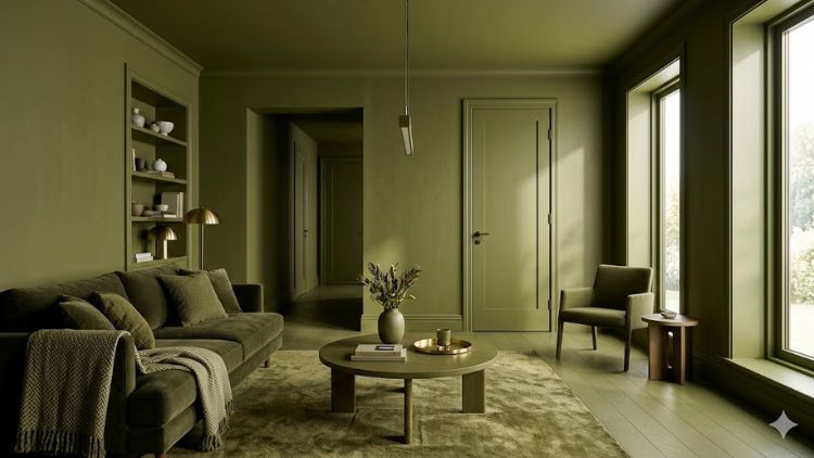
Most painters treat the ceiling like a white lid on a colored box. They say it opens the space up. Colour drenching does the exact opposite.
It blurs the line where the wall ends and the ceiling begins. Since there is no harsh white line telling your brain where the room stops, the ceiling actually feels higher. It creates a seamless envelope of color that feels comforting and premium.
A beautifully colour drenched living room showcasing a seamless, borderless design.
Why is Everyone Obsessing Over This Paint Trend?
This isn’t some random TikTok fad that will look embarrassing in a year. It is a massive design cheat code. It gives you an architectural, custom look without forcing you to buy expensive furniture.
It hides all the ugly features: If your room has weird wall angles, an uneven ceiling, or ugly radiators, you just paint them the wall color. They disappear.
Instant designer look: It gives off a custom, architect-designed vibe that standard white-trim paint jobs can just never compete with. In fact, major design experts consistently feature mono-tonal rooms in the Sherwin-Williams Colormix Forecast as a top luxury styling method.
It makes tiny spaces look huge: It is an absolute lifesaver for small, tricky areas like narrow entryways, cramped home offices, or powder rooms where multiple colors just create messy visual clutter.
However, diving into this without a plan is how major colour drenching mistakes usually happen.
8 Critical Painting Mistakes That Will Ruin Your Drenched Room
When you use one single shade on every surface, any minor mistake in execution gets magnified by ten. Here are the big traps DIYers fall into and how to avoid these frustrating colour drenching mistakes.
1. Buying the Exact Same Paint Can for Everything
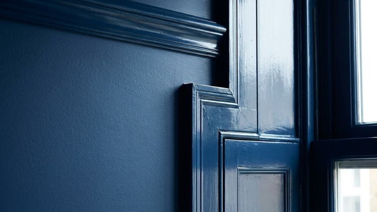
This is the absolute number one error on the list of common colour drenching mistakes. Just because you are using the same color does not mean you should use the same paint finish everywhere.
If you roll a single flat paint on the walls, doors, and trims, your room will end up looking like a cheap, flat cardboard box.
You have to play with light reflection.
Get a Flat or Matte finish specifically for the ceiling to hide any plaster flaws.
Use an Eggshell or Satin finish on the main walls for a soft, cleanable glow.
Then, use a Semi-Gloss or High-Gloss version of that exact same color for your wooden doors, baseboards, and window trims.
That subtle shift in shine is what keeps the room looking alive and rich.
Using different paint sheens in the same color prevents the room from looking flat.
2. Trusting Those Tiny Paper Store Swatches
We’ve all done it. You look at a two-inch paper swatch at the store, and it looks like a beautiful, calming olive green.
But when you slap that exact shade across four full walls and a ceiling, it can easily transform into a loud, aggressive swampy nightmare.
Never skip sample pots. Paint large pieces of old cardboard and tape them to different walls. Look at them at 7 AM, look again at 3 PM, and check them at night under your regular light bulbs.
Paint reflects off itself, so a color will always look way deeper and heavier when it’s bouncing off all four corners and the ceiling. Skipping this step is how you end up with messy colour drenching mistakes you’ll regret.
3. Ignoring the Direction of Your Natural Light
Light dictates everything in a monochromatic space. If you take a chilly, north-facing room that gets almost no direct sunlight and drench it in a cool, slate gray, you are going to end up sitting in a room that feels like a damp basement.
Check your windows first. If a room gets limited or cool natural light, you need to choose colors with warm undertones : think soft creams, warm beige, or muddy terracottas.
Save the moody, dark jewel tones like deep navy or charcoal for rooms that get blasted with warm afternoon sun, or for spaces where you want to embrace a dark, cozy feeling anyway, like a bedroom or a media room.
4. Panicking and Chickening Out at the Ceiling
I see this happen all the time. Someone gets halfway through their project, their walls look incredible in a deep shade, and then they suddenly panic. They get scared the room will feel too dark, so they stop and leave the ceiling bright white.
Please don’t. When you put a stark white ceiling on top of dark, drenched walls, you create this massive, jarring horizontal line.
It actually makes the white ceiling feel heavy, like it’s crashing down on your head. Trust the process.
If you are genuinely terrified of a dark ceiling, just ask the paint shop to mix your wall color at 50% strength with white paint for the ceiling portion. It keeps the tonal family but lightens the load above you.
5. Leaving White Plastic Switch Plates Alone
Imagine spending a whole weekend perfectly painting your room a gorgeous, seamless forest green. You clean up, step back to look at your work, and your eyes smash right into a cheap, bright white plastic outlet cover sticking out like a sore thumb. It breaks the entire magic spell.
The fix is simple: paint them. Take the covers off, give them a quick, light sanding so they aren’t shiny, hit them with a good primer, and coat them in your wall color.
Leaving them bright white is one of those small colour drenching mistakes that completely ruins the high-end illusion.
Recommended Tool for Sharp Edges: To get clean lines around your molding and outlets without making a mess, using a high-quality brush like the Purdy XL Elite Series Glide Angular Trim Paint Brush makes detail work incredibly easy.
6. Forgetting to Look Down at Your Floors
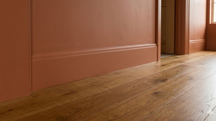
Your floor is a massive surface area, and your new paint color has to sit right next to it. If you choose a beautiful, rich, warm chocolate brown for your walls but your floor has a very cool, gray laminate or tile finish, the room is going to feel completely disconnected and awkward.
Always look at your flooring undertones before buying paint.
If you have warm wooden floors, lean into warm, earthy wall colors.
If your tile or carpet is cool and gray, make sure your paint color has a cool undertone.
This simple check ensures the whole room feels like it belongs together from the ground up.
Make sure your flooring tones harmonize with your chosen wall color.
7. Trying to Skip the Primer on Trim and Doors
Drywall and wood are two completely different beasts. Drywall drinks up paint evenly, but old wooden baseboards or pre-glossed doors are smooth and stubborn.
If you try to roll your standard wall paint straight onto a shiny door without preparing it, that paint will start scratching and peeling off with your fingernail within a month.
You cannot skip the prep work. Give your wooden trims a light sand to rough up the surface, put down a solid coat of multi-surface primer, and then apply your trim paint.
It takes a little extra time, but it saves you from a total breakdown later when your vacuum cleaner bumps into the baseboard and chips the paint.
Essential Tool for Clean Borders: Before you apply any primer or paint near your wooden baseboards and floors, masking them off with a premium ScotchBlue Original Multi-Surface Painters Tape is an absolute lifesaver to stop bleeding and get razor-sharp lines.
8. Buying Furniture That Matches the Paint Too Perfectly
Monochrome design does not mean your sofa, your rugs, your curtains, and your throw pillows all need to be the exact same shade as your walls. If you do that, your furniture just dissolves into the background.
The whole space ends up looking like a painted television studio set instead of a real, lived-in home.
You need contrast, and you get that through texture. If your walls are a deep, drenched navy, don’t buy a navy sofa. Bring in a rich cognac leather accent chair, a cream boucle couch, or a chunky, woven jute rug.
The solid, drenched walls should act as a beautiful, quiet backdrop that makes your actual decor stand out.
Best Color Schemes to Try (By Room Type)
Here is a quick cheat sheet of color directions that are working beautifully for homes right now.
Space
Color Palette
Why It Works
Small Entryway
Deep Charcoal / Forest Green
Creates a dramatic, expensive first impression right at the door.
Primary Bedroom
Soft Sage / Cloud White
Pure relaxation. Erasing the ceiling lines helps your brain wind down.
Home Office
Chocolate Brown / Deep Olive
Excellent for focus. Removes distracting visual clutter from trims.
Power Room
Moody Teal / Burnt Ochre
Turns a boring, tiny bathroom into a gorgeous jewel-box experience.
How to Soften the Look
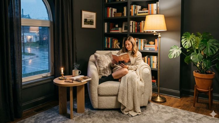
The biggest fear most people have is that the room will feel claustrophobic or intense. But the secret to softening a drenched space has nothing to do with the paint itself : it’s all about your styling.
You need to bring in raw, natural textures. Think warm wood accents, touches of brass, and soft linen curtains that pool slightly on the floor.
Green Accent Idea: If you want to tone down the heavy paint vibes even more, scattering some low-maintenance greenery around the corners works like magic. To get started, take a look at our selection of 10 Jaw-Dropping Colorful Houseplants That Actually Thrive on Neglect to contrast your monochromatic backdrop beautifully.
And whatever you do, please turn off that harsh, single overhead ceiling light. It throws ugly, intense shadows in a monochrome room.
Instead, scatter lamps at different heights. Put a small accent light on a bookshelf, a tall floor lamp in a dim corner, and use warm-toned bulbs. The light will catch those different gloss and matte paint finishes beautifully, creating a rich, layered glow that looks incredibly expensive.
Layering textiles and warm lighting prevents a drenched room from feeling cold.
At the end of the day, paint is the cheapest, most transformative tool you have in your home decor toolkit. If you are tired of the same safe, predictable rooms and want to give your home a real, designer-led identity, don’t stop when you hit the top of the wall.
Keep going, paint the ceiling, and just embrace the drench. It might just be the best design risk you ever take.
FAQ :
What is color drenching in painting?
Color drenching is an interior design technique where you take one single paint color family and apply it to every single surface in a room. Instead of just painting the drywall and leaving the rest white, you coat the walls, baseboards, doors, window trims, and the entire ceiling in the exact same shade. This eliminates all contrasting borders, blurring the edges of the room to create a seamless, high-end, and deeply cozy envelope of color.
What are common colour drenching mistakes DIYers regret?
The absolute biggest colour drenching mistakes DIYers face is using the exact same paint finish (like flat or gloss) everywhere, which makes a room look like a cheap cardboard box. Other major regrets include picking a dark color based on a tiny paper swatch without testing sample pots on the wall, skipping wood-specific primer on glossy doors and baseboards (causing the paint to peel off later), and forgetting to check how the room’s natural daylight alters the paint undertones throughout the day.
Is color drenching good or bad?
It is incredibly good if you want to make a small room feel massive, hide ugly architectural features like pipes or radiators, and get a luxury designer look on a tight budget. However, it can turn out bad if you chicken out halfway through and leave the ceiling white, or if you choose a cold, slate color in a room that gets zero natural sunlight, which instantly transforms your space into a gloomy, depressing cave.
What to paint first when avoiding colour drenching mistakes?
When trying to avoid basic colour drenching mistakes, you should always follow the standard top-to-bottom rule, meaning you paint the ceiling first. Starting with the ceiling prevents any stray paint splatters or drips from landing on your freshly finished walls or trim. Once the ceiling is done, move down to the main walls, and always save the wooden trims, baseboards, and doors for the final step since they require different paint sheens and precise detail work.